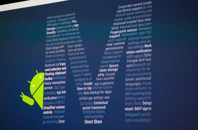
Google I/O 2015 held in San Francisco presented before everyone the all new Android M! What M stands for ahmm…no idea. This has been left for the users to keep guessing and maintain slight suspense. Android M is still in its early stages and Google has just released a Developer Preview to let users feel the difference and experience few of its key features which we are going to discuss. This update mainly deals with polishing the former Andorid Lollipop (v5.0) but also have loads of new tweaks.
[button color=”red” size=”big” alignment=”center” rel=”nofollow” openin=”samewindow” ]1. Doze[/button]
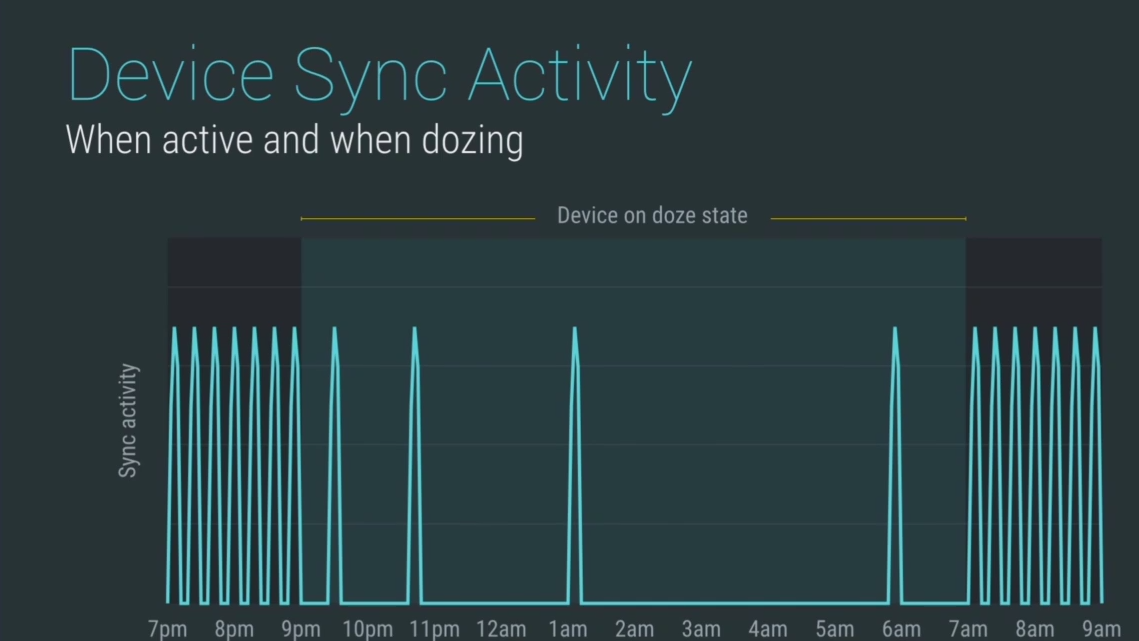
This is quite a new intelligent feature built into Android M which deals with better battery management. Android Lollipop really sucked at battery management, which annoyed the users deeply. This is really useful as it checks using all the sensors present that whether the phone is being used frequently or not and if in case the phone is kept idle for a certain period of time, it cuts off all the sync and background processes and forces the phone to go in deep-sleep which reduces power usage significantly.
[button color=”blue” size=”big” alignment=”center” rel=”nofollow” openin=”samewindow” ]2. Improved Volume Control[/button]
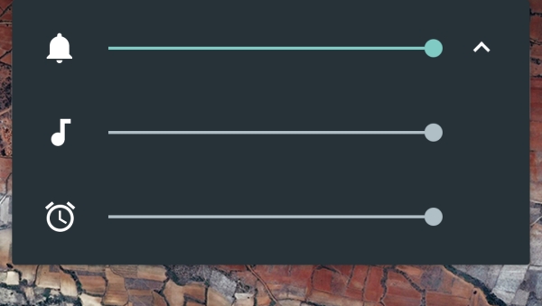
This is just a slight change which now seems to be perfect and practical. Not having Silent Mode in Android Lollipop upsetted many of its users but now with Android M, it’s back and can be accessed by holding down the volume down button. The extended Volume Control Option is also included which lets users to control media and alarm volumes from a drop down button in the ringtone volume floating bar. The interruption feature has been removed from the volume bar and is renamed as Do Not Disturb (DND), which is now individually present in the quick settings panel.
[button color=”red” size=”big” alignment=”center” rel=”nofollow” openin=”samewindow” ]3. Improved Text Selection[/button]
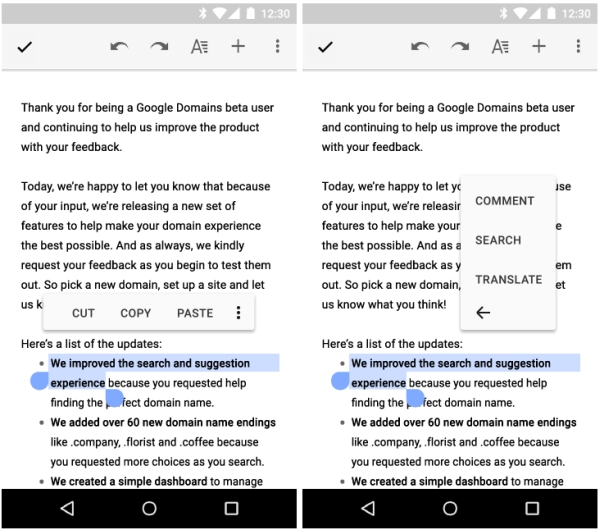
This was one of those parts where Google hasn’t made any changes since a long time but now it has been made much neater and feasible. With this new update after selecting some text, a clean floating toolbar pops up which has cut, copy and paste options with a menu for some additional options such as translate and search. Selection of texts now moves forward intelligently word by word, which makes it a lot more easier and comfortable. Though this feature is not present in the developer preview.
[button color=”blue” size=”big” alignment=”center” rel=”nofollow” openin=”samewindow” ]4. UI Changes[/button]
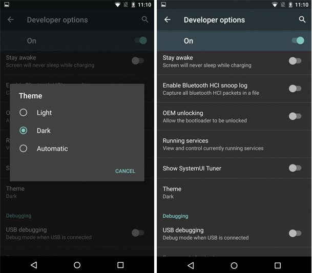
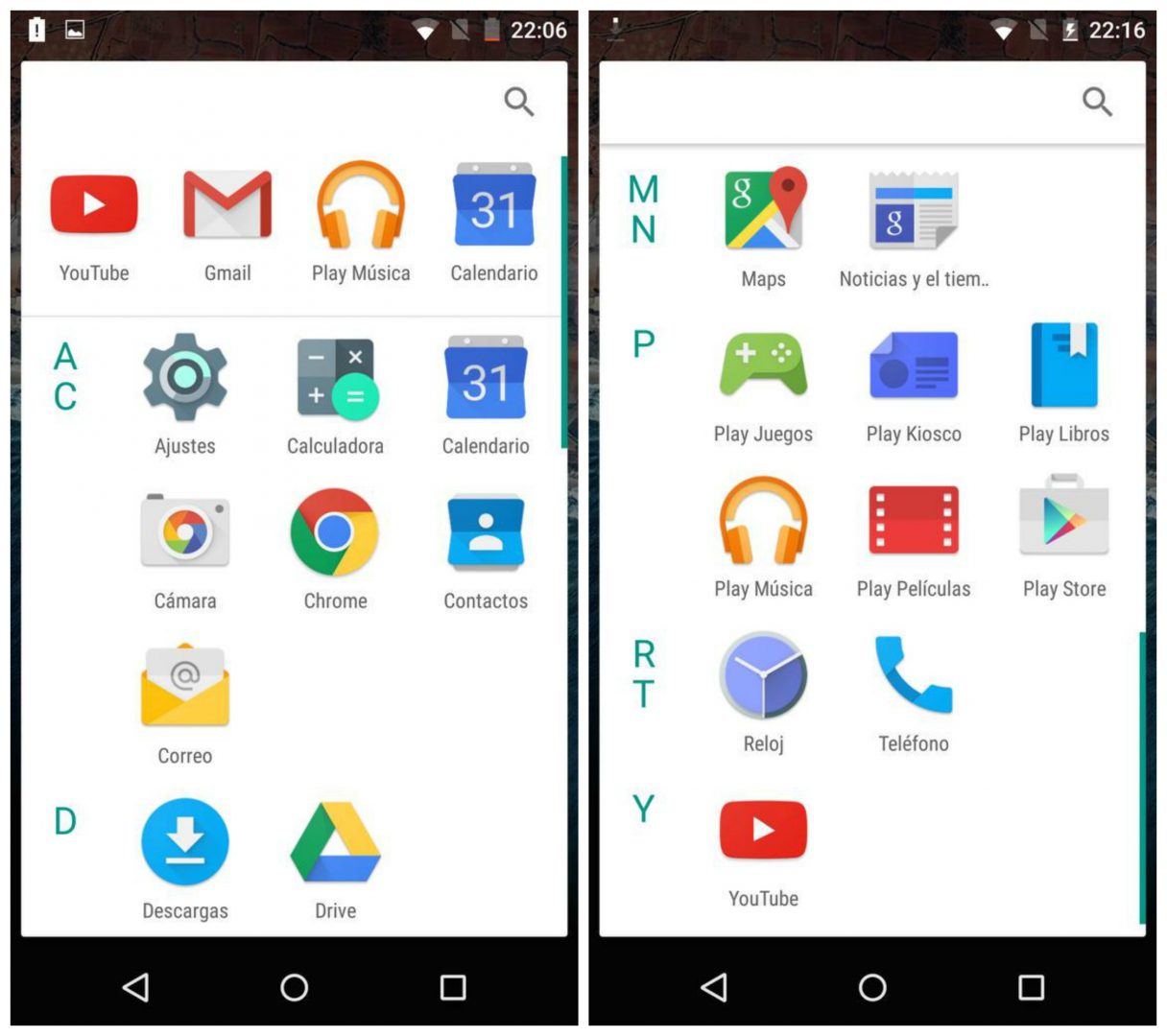
All the above mentioned updates are impressive but this is something I think Google did for no reason. The app drawer is changed which lists apps alphabetically, scrolling vertically in grids. Same goes with the widgets drawer. A search bar has been added with most used app at the top. The lockscreen also undergoes certain changes. Clock gets a new font which makes it much more clear. The Dialler gets replaced with Voice Search in the lockscreen shortcuts. The animations have been made much more fluidic with UI elements popping in and out. Swiping Up from the Home Key initiates the new Google Now On Tap UI. In Developer Options, there is also an option to switch between Dark or Light or Automatic theme which presently only affects the Settings app.
[button color=”red” size=”big” alignment=”center” rel=”nofollow” openin=”samewindow” ]5. Direct Share[/button]
Sharing apps, music, pics etc. has already been very comfortable with Android but Google has tried to add cherry on the top. With Direct Share, Android now learns from your past sharing experiences and uses that data to keep certain used apps or frequently contacted people from your contacts at the top of the list.
These were the major highlights of the new Android M. It still requires a lot of tweaks and improvements before the final clear cut Android M is good to go. Many more things might be introduced and some might be removed. This is the very first build which Google has released and there’s a long way to go.


